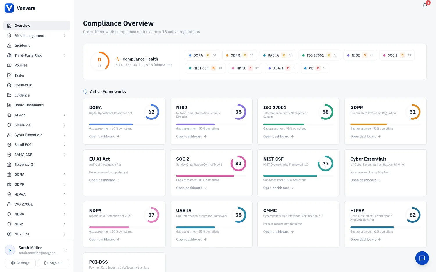
Venvera uses a sidebar navigation on the left and a main content area on the right. The interface adapts to your screen size and supports both light and dark themes.
Sidebar structure
The sidebar is organised into logical sections:
| Section | Contents |
|---|---|
| Overview | Cross-framework compliance dashboard — your landing page |
| Shared Modules | Risk Management, Incidents, Third-Party Risk (TPRM), Policies — shared across all frameworks |
| DORA | Dashboard, Register of Information (with sub-items: Providers, Contracts, Functions, Risk Assessments, Branches, Sub-outsourcing, Concentration Risk, Export), Gap Assessment, Resilience Testing |
| NIS2 | Dashboard, Gap Assessment, Management Training, Incident Readiness, Certifications, Effectiveness KPIs |
| ISO 27001 | Dashboard, Controls (Statement of Applicability), Gap Assessment, Internal Audits, Nonconformities, Management Reviews, Training, Documents, Certification |
| GDPR | Dashboard, Processing Activities, Data Subject Requests, Gap Assessment, DPIAs, DPAs, Breaches, Transfers |
| EU AI Act | Dashboard, AI Systems, Classification, Gap Assessment, Incidents, Technical Documentation, Data Governance, Human Oversight, Monitoring, Conformity & CE |
| Reports | Board Reports, Audit Trail, Regulatory Updates |
| Settings | Company Profile, Users (admin only), Organisation Settings |
| Additional frameworks | SOC 2, NIST CSF 2.0, Cyber Essentials, CMMC 2.0, HIPAA, PCI-DSS, NDPA, UAE IA, Saudi ECC, SAMA CSF, and Solvency II - each appears only when enabled for your organisation, with its own dashboard, controls, gap assessment and evidence sub-modules |
| Tasks | Cross-framework task and remediation tracking |
| Crosswalk | Control Crosswalk - per-domain compliance status across every enabled framework |
| Evidence | Central evidence library shared across frameworks |
| Board Dashboard | Executive-level compliance summary for board reporting |
| Integrations | Cloud posture scans (Azure, AWS, Google Workspace) and the endpoint agent |
Each framework section expands to show its sub-modules when clicked. Only frameworks enabled for your organisation appear in the sidebar.
Collapsible sidebar
On desktop, click the collapse arrows at the bottom of the sidebar to minimise it to icons only. This gives you more screen space for content. Hover over an icon to see a tooltip with the section name.
Theme switching
Venvera offers a Light and a Dark theme. Open Settings and use the Appearance section to choose your theme (and text size). Your choice is saved per user and persists across sessions.
Mobile navigation
On smaller screens, the sidebar is hidden by default. Tap the hamburger menu icon (three horizontal lines) in the top-left corner to open it as an overlay. Tap any link or the backdrop to close it.